Case Study
Pre-Launch Brewery Branding & Packaging for Garland City Beer Works
A modern brand identity for a heritage-driven craft brewery in Watertown, New York.
Services: Branding · Naming · Packaging · Merchandise
Overview
- Industry: Craft Beer
- Services: Branding, Naming, Packaging, Merchandise
- Location: Watertown, New York
Blindspot Agency developed the founding brand identity for Garland City Beer Works, a craft brewery in Watertown, New York, during its pre-launch, brewery in planning stage in 2016–2017. The work spanned research, positioning, product naming, logo design, packaging, merchandise, signage, and glassware concepts — a complete visual system built before the brewery opened its doors.
What We Delivered
- Brand research & positioning — Watertown history, competitive landscape, reference brands
- Logo & identity system — primary wordmark plus alternate lockups
- Product naming — a heritage-based naming system for the beer lineup
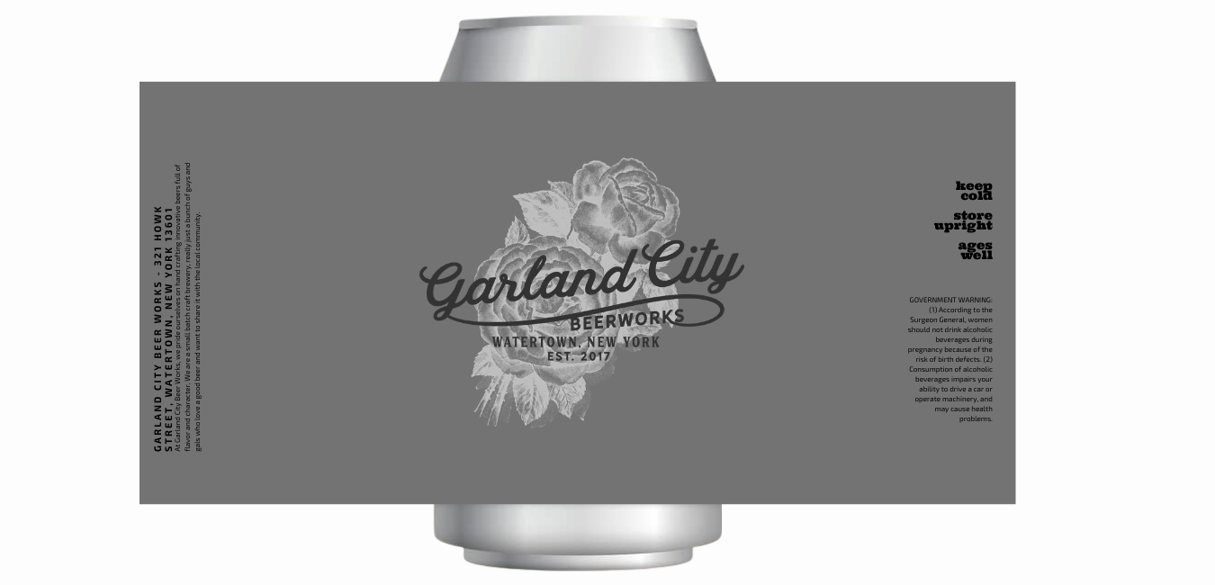
- Packaging concepts — can and bottle label designs
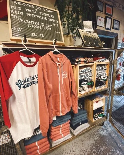
- Merchandise — apparel and drinkware concepts
- Environmental — taproom signage and tap-handle designs
- Glassware — branded pint and tasting-flight glasses
The Challenge
Turning a city’s history into a brand that belongs on a modern shelf
Garland City Beer Works came to the project with a strong story and no visual identity. The founders wanted the brewery to represent Watertown’s industrial roots, the city was known as the “Garland City” in the late 1800s, when its downtown buildings were draped in red, white, and blue garland for civic celebrations.
The story was rich. The risk was in the execution. Heritage is one of the most common themes in craft beer, and it is easy to render it literally — distressed type, sepia photographs, period clip-art — in a way that reads as dated the moment it hits a crowded shelf. The brand’s early exploratory concepts leaned in that direction: vintage Americana, ornate lettering, historic building imagery.
Working closely with Head Brewer Troy Parker, the brief for Blindspot was to keep the history and lose the cliche to build a brand that honoured Watertown’s past while looking like it belonged next to the best modern craft breweries in the country.
What Blindspot found: heritage works best when it’s translated.
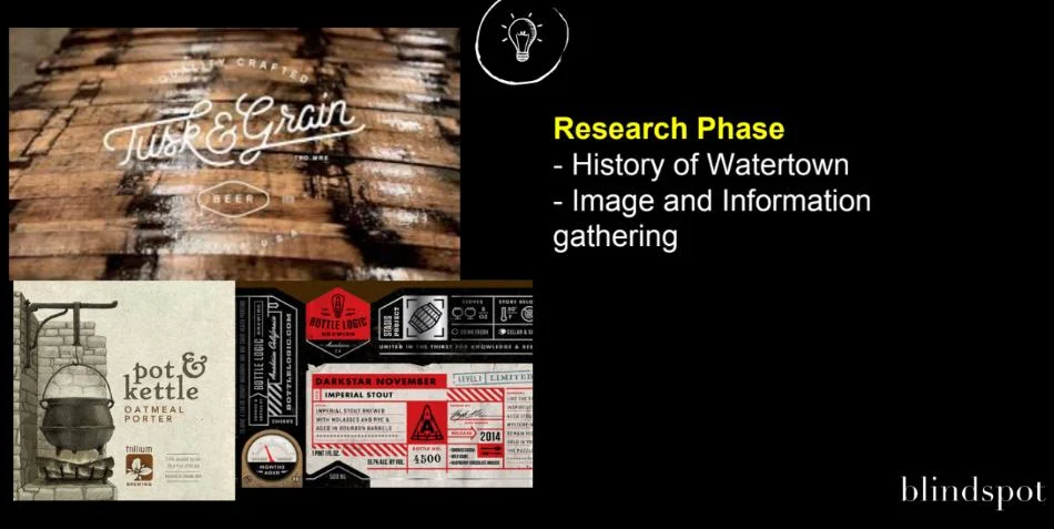
The research phase started with Watertown itself — the city’s history, its architecture, the “Garland City” name, and the visual language of the era. But the more important input was the competitive one: how the strongest contemporary craft breweries handle heritage without looking old-fashioned.
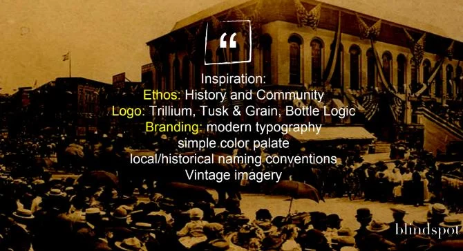
Reference brands like Trillium, Tusk & Grain, and Bottle Logic pointed to a clear pattern. The breweries that feel both timeless and current don’t decorate with history — they distill it. They pair clean, modern typography with restrained palettes and use vintage imagery as a single, deliberate accent rather than as the whole design. Heritage becomes a note, not the entire composition.
That became the organizing principle for Garland City: modern typography, a simple color palette, historically grounded naming, and vintage imagery used sparingly and intentionally.
How Blindspot built the brand: from sketches to a full identity system
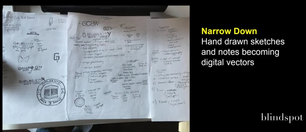
Blindspot moved from hand-drawn exploration into refined digital concepts, developing several distinct directions for the founders to react to.
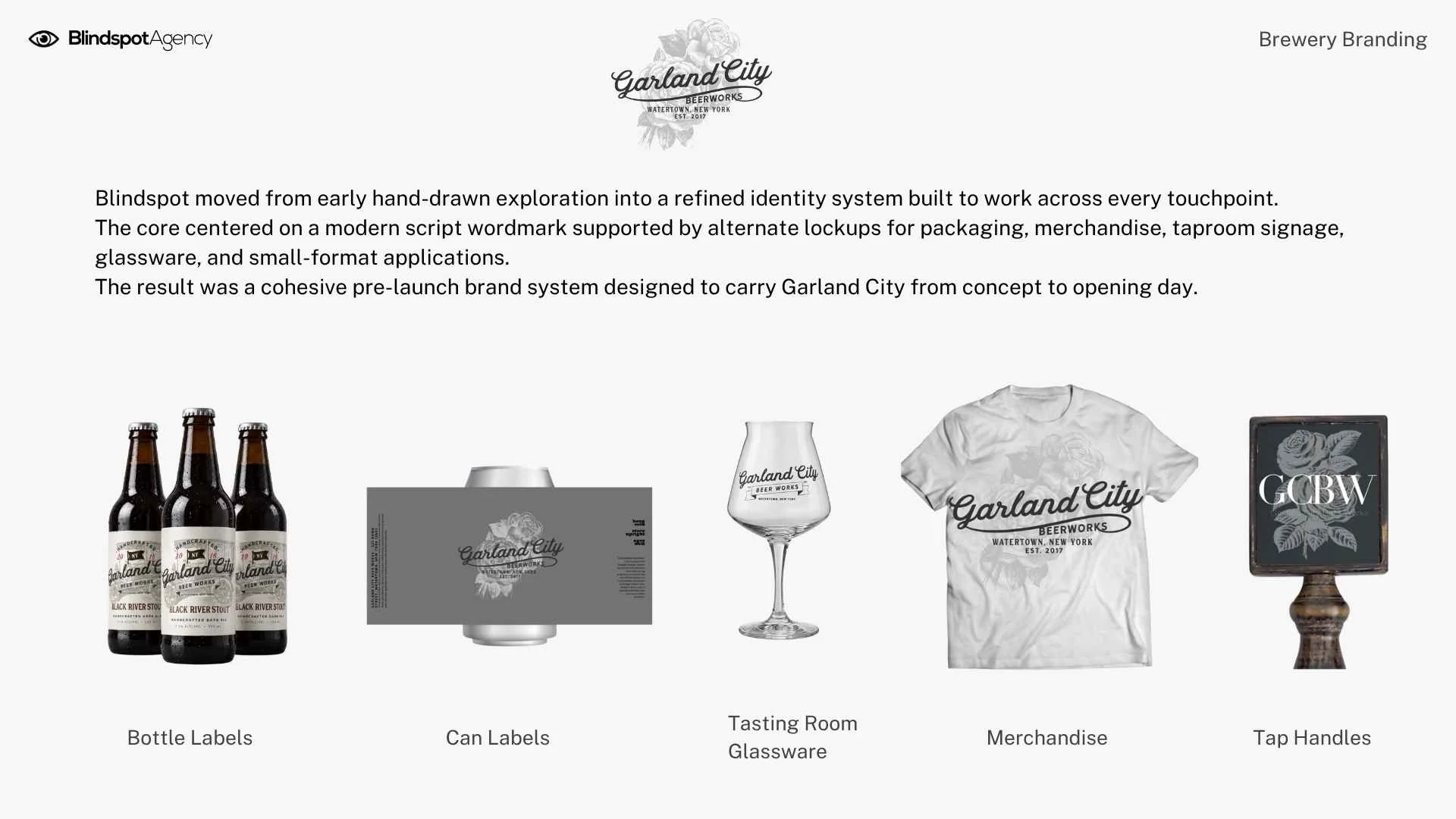
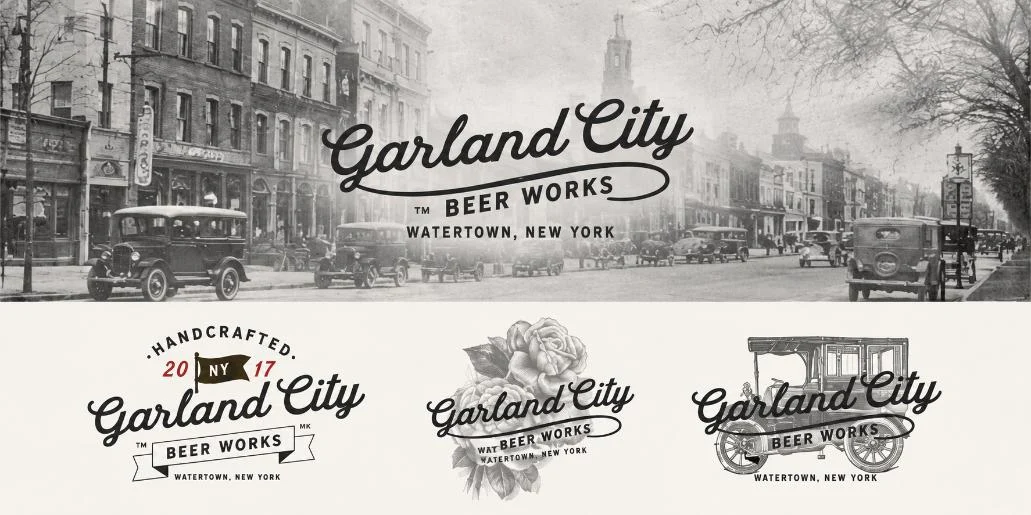
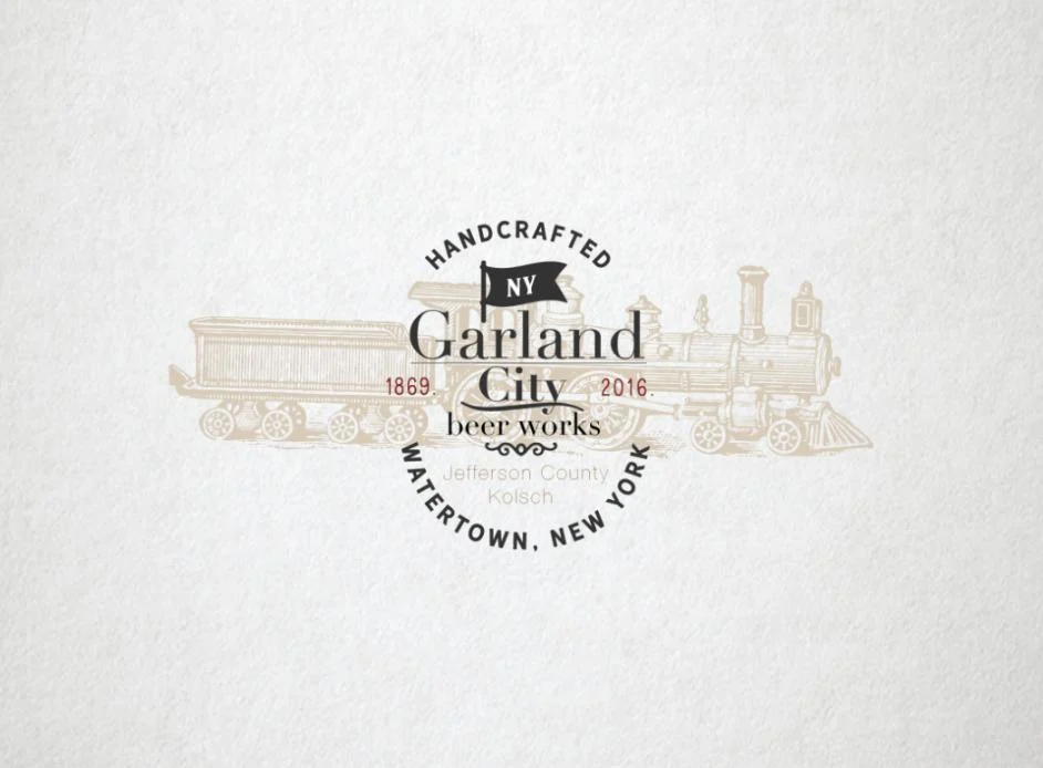
The core identity centered on a confident modern script wordmark — “Garland City Beer Works” — that could carry the brand across packaging, glassware, and merchandise without relying on period decoration. From there, Blindspot developed a family of lockups and alternate marks, so the brand could flex across contexts: a stacked badge for taproom and merchandise, a horizontal lockup for labels, and simplified variants for small-format applications.
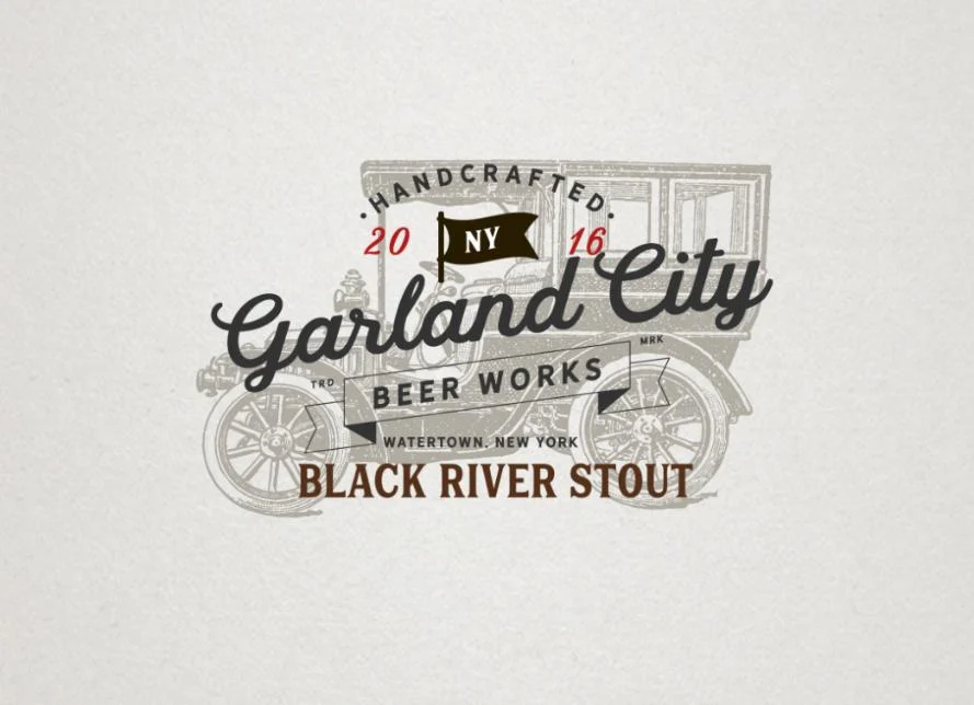
Vintage imagery earned its place as accent rather than foundation. A single engraved element — a rose, a period automobile — anchored select lockups, giving the brand a sense of place without turning every surface into a history lesson.
The product naming system tied the beer lineup directly to Watertown. Rather than generic style names, the beers drew on local landmarks and geography — Black River Stout and Jefferson County Kölsch among them — so the brand’s story lived in the lineup itself, not just the logo.
That identity system was then extended across every pre-launch touchpoint a new brewery needs: can and bottle labels, taproom signage and tap handles, apparel, and branded glassware for the tasting room.
Why this approach?
Strong heritage craft brands like Anchor or Sierra Nevada don’t win on history alone, they translate that history into something a customer can recognize on a shelf and remember later. By treating Watertown’s heritage as a story to distill rather than a style to reproduce, Blindspot gave Garland City Beer Works a brand system that was distinctive, ownable, and built to scale from a single taproom outward.
For a brewery still in planning, the value was a complete, launch-ready visual foundation — identity, naming, packaging, and environment — established before the first beer was poured and one that could be leveraged to build trust in key stakeholders at this stage like early investors, commercial loan officers, landlords and early brewery and taproom hires.